
Children’s book illustrator-How I built A handmade underwater illustration from scratch
An underwater illustration from scratch as a children’s book illustrator
People often see the final artwork first. They see the smiling fish, glowing corals, deep blue water, and soft lighting. But behind every finished illustration, there are many quiet stages that slowly bring the scene to life.
As a children’s book illustrator, I enjoy that slow process more than anything else.
I never begin with the character immediately. I first sat with the scene’s mood. I imagine how a child might feel as they look at the page before bedtime. I want the children to relate directly to the illustration.
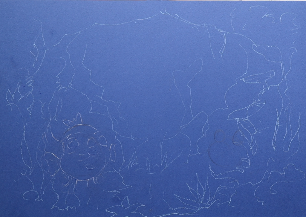
For this underwater scene, I started with a blank, dark surface and gradually built the ocean atmosphere. I made this on ocean blue paper. I just drew the lines roughly. No shape, no perfect structure. Just a rough outline.
I started deep ocean blue from the corner, the soft blue shades, to make it feel calmer and dreamier. I kept the center area bright to make it look like sunlight was softly entering the ocean water from above. Before drawing characters, I try to imagine and feel the full scene inside my head. I ask myself simple questions.
Will it feel magical?
Will a child pause and keep looking at the page for an extra second?
Those things matter to me more than making the artwork look complicated.
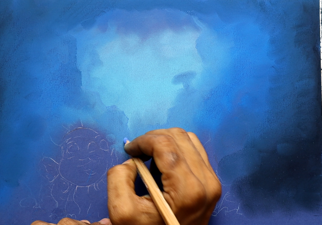
At the beginning, the artwork looked messy and unfinished. Honestly, most illustrations do in the early stage. I think many people would be surprised to see how rough things look before the details arrive.
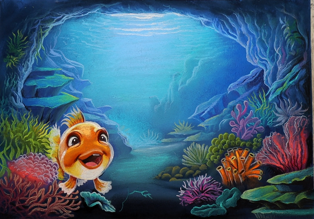
After placing the blue tones, I started shaping the rocky cave areas around the sides. I did not use many hard lines because I prefer softer shapes in children’s illustrations. Soft edges feel friendlier. They also help the page feel more peaceful.
At the early stage, nothing looks impressive. It is mostly soft colors and rough shapes. But that part matters a lot because it builds the mood before the characters arrive.
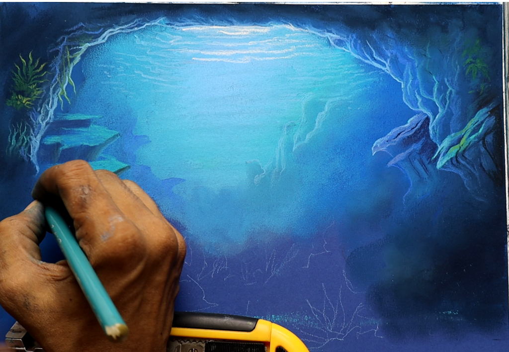
Then I added sea plants and coral forms around the borders.
I never like leaving the environment empty. Even a small background area should feel alive. Children notice little things adults often ignore. A tiny plant or hidden shape can become interesting for them.
That is one reason I enjoy drawing so much.
Children really look at the illustration carefully.
Once the underwater background started feeling balanced, I moved towards the fish character. That is always my favorite stage because the character changes the energy of the entire scene.
I first made a very light sketch. Nothing detail. I only focused on basic shape and expression. For me, expression is more important than perfection.
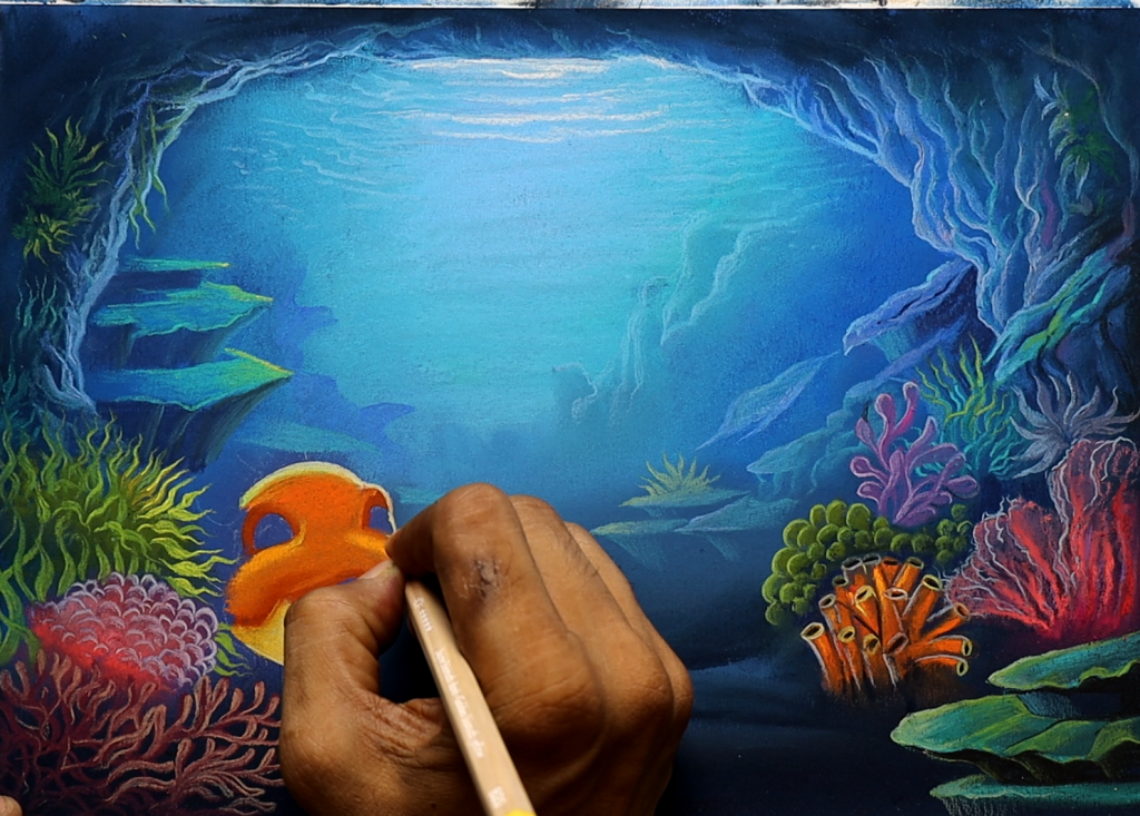
I first made a very light sketch. Nothing detail. I only focused on the basic shape and expression. For me, expression is more important than perfection.
I wanted the expression to feel honest before anything else. Children connect very quickly with facial expressions. If the eyes feel empty, the whole illustration loses emotion.
I wanted the fish to look curious, cheerful, almost like it had discovered a new underwater place or met an old friend. So, I made the eyes bright and large. I kept the smile open and playful because a happy expression comes naturally to children. The children’s excitement is important in my work.
As a freelance children’s book illustrator, I’ve learned something over the years.
Children respond to warmth very quickly. They do not care if a drawing is technically perfect. They care about feeling.
That feeling is always my first priority.
After the sketch was ready, I slowly built color on the character. I chose warm orange tones because the background was mostly cool blue. Warm colors naturally pull the attention. They also try to make the character feel cheerful. They also make the character feel cheerful and friendly. I blended yellow and cream shades around the face to keep the expression soft instead of harsh.
I never rush coloring.
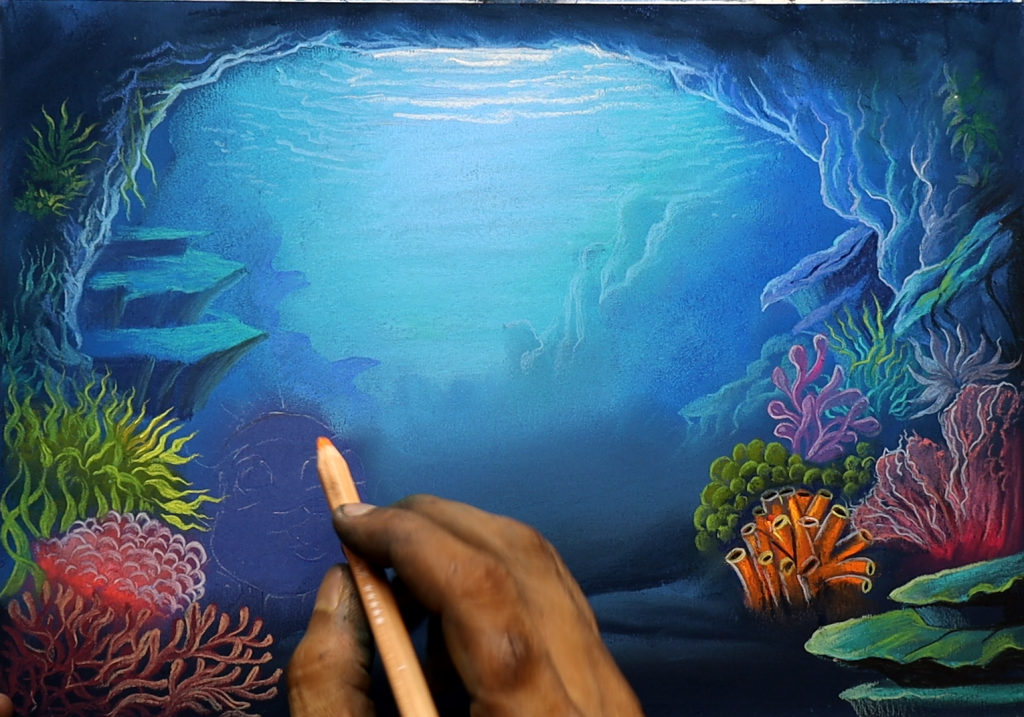
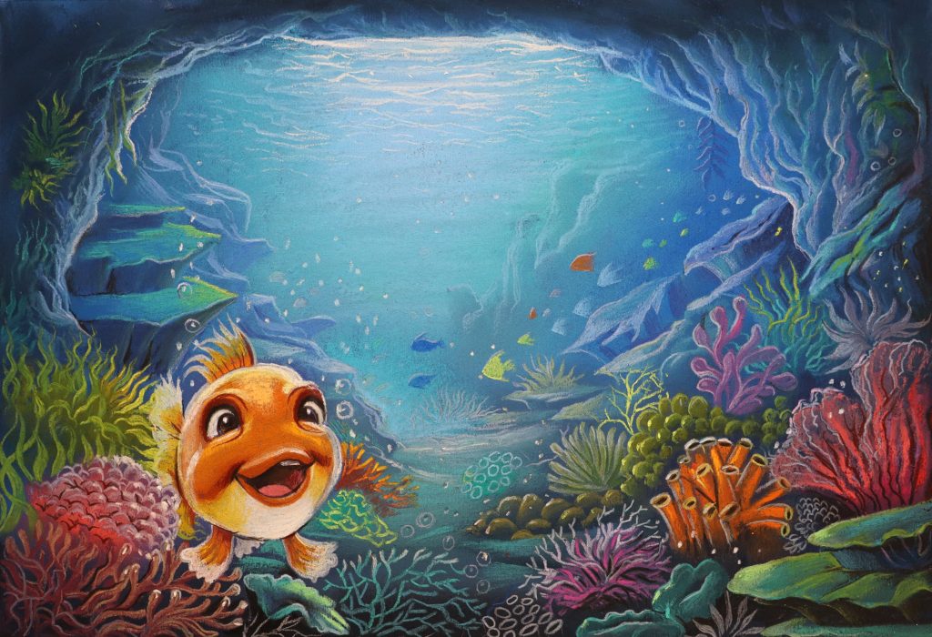
I prefer layering color little by little because it creates a smoother and more natural feeling. Hard coloring can sometimes remove the softness from children’s illustrations. I always want my artwork to feel gentle enough for a child’s imagination. As the fish became brighter, I added more details to the underwater world. Corals, sea plants, tiny bubbles, rocks, and glowing textures slowly filled the scene.
Children notice details that adults sometimes ignore.
A small coral shape in the corner, tiny bubbles floating upward, or a little fish hidden far in the background can make a child stay longer on the page. That is why I enjoy detailing so much. It adds a small surprise to the artwork.
Many authors who hire a children’s book illustrator tell me they want illustrations that children can return to again and again.
I always keep that in mind while drawing. I try to create pages that still feel interesting after multiple viewings.
One thing I paid close attention to in this artwork was depth.
I wanted the whole page to feel quiet and peaceful, not noisy.
For me, illustration has never been only about drawing nice pictures.
I always try to place emotion inside the artwork. I want children to feel curiosity, comfort, happiness, and imagination while looking at the page. That matters much more to me than showing technical skill.
As one of many children’s book illustrators working with authors, I know every story deserves warmth and heart inside the artwork.
That is what I try to give through my illustrations.
To know more: www.anantaart.com
Pinterest: https://in.pinterest.com/illustratorananta/
Behance: https://www.behance.net/ananta-mohanta
Follow me on Instagram: www.instagram.com/ananta_mohanta_
Leave a Reply