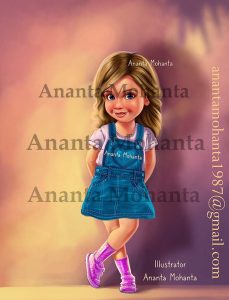
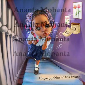
Hi everyone! I’m Anta Mohanta, a passionate children’s book illustrator. There is nothing quite like taking a writer’s words and turning them into vivid, colorful worlds that spark a child’s imagination and keep them flipping the pages.
Every story is unique, and finding the right artistic style for your manuscript is one of the most important steps in the publishing journey. I know how big of a decision it is to trust someone with your story—which is why I like to make the process as smooth and confidence-boosting as possible.
Illustrated by Ananta Mohanta
Try Before You Commit: Free Demo Illustration 🎨
To help you visualize how your characters and world will look on the page, I offer afree demo illustration for prospective authors and publishers!
Here is how it works:
Share Your Vision: Tell me a bit about your book, your main characters, and the vibe you are aiming for.
Get a Free Demo: I will create a sample illustration based on your manuscript so you can see my style in action with your story.
Collaborate & Refine: If you love it, we can move forward with creating the full book together!
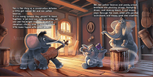
📖 A Peek Behind the Canvas
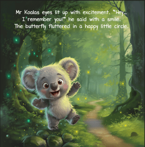
Here is a look at one of my latest completed book spreads! In this scene, we meet little Abi, her father Emerick, and their friend Grootman sharing a cozy, musical afternoon filled with warm sunshine, happy rhythms, and good vibes.
From warm, inviting lighting to expressive character expressions, I love creating entire worlds where stories truly come alive on the page.
🎨 Are You an Author Bringing a Book to Life?
If you are an author or publisher looking for an illustrator to turn your manuscript into a beautifully visual story, I’d love to collaborate with you!
Children’s Book Illustrator: How a Simple Sketch Slowly Becomes a Storybook Scene
Most people only see the finished illustration inside a children’s book. They see the polished colors, glowing lights, cute characters, and detailed background. What they usually never see is the messy beginning.
For me, that beginning is often the most important part.
After working for more than 15 years as a professional children’s book illustrator, I have realized something very simple — strong illustrations are not built by rushing. They grow slowly, piece by piece, until the artwork finally starts feeling alive.
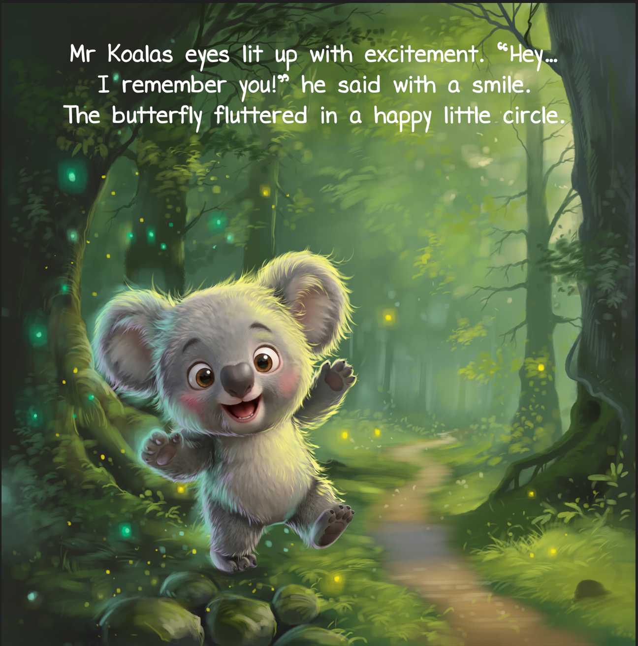
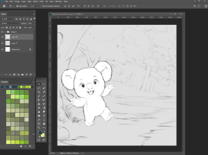
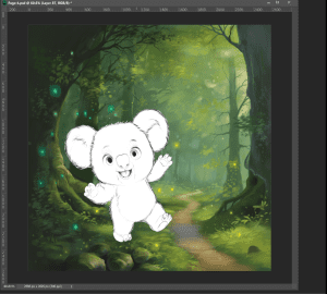
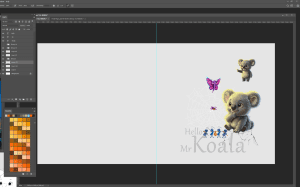
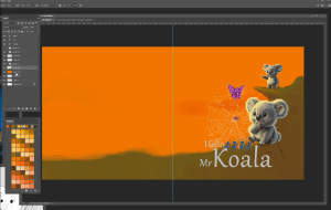
This forest koala illustration was exactly like that.
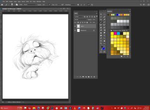
When I first opened the blank canvas, there was nothing magical about it. Just rough pencil lines and an unfinished character standing in empty space.
But honestly, that is how almost every good children’s book illustration begins.
The Character Always Comes First
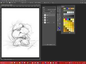
Before adding trees, grass, glowing lights, or background details, I always focus on the character.
In the first sketch, the koala looked very basic. No textures. No colors. No atmosphere.
Illustrated by Ananta Mohanta
At that stage, I only cared about one thing:
“Does this little character feel friendly enough for children to instantly like him?”
That question matters more than technical details.
Children react to emotion first. They notice expressions before they notice color palettes or background painting. Even a small change in the eyes or mouth can completely change how a character feels.
So I spent time adjusting the pose, ears, smile, and body movement until the koala finally started feeling playful.
I wanted him to look curious, energetic, and full of excitement, almost as if he had just wandered into a magical forest for the very first time.
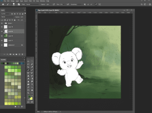
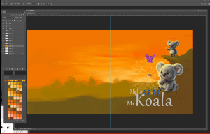
Slowly Building the World Around Him
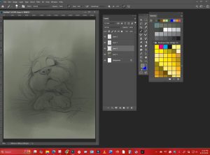
Once the character felt right, I started creating the environment around him.
Illustrated by Ananta Mohanta
This stage always takes longer than people expect.
A forest scene may look natural in the final artwork, but while painting it, every little detail has to be considered carefully — where the light enters, how dark the corners should be, how much texture belongs on the ground, and how the trees guide the viewer’s eyes through the page.
In the earlier versions of this illustration, the forest looked soft and unfinished. Large areas were empty. The pathway barely existed.
That never worries me.
I actually enjoy this stage because it gives me freedom to experiment without pressure.
Sometimes I remove entire sections halfway through painting. Sometimes I repaint the same lighting area four or five times before it feels correct.
That happened several times in this project.
Why Organization Matters in Illustration
One thing many people do not think about is how much organization matters in professional children’s book illustration.
illustrated by Ananta Mohanta
Inside Photoshop, I keep shadows, lighting, textures, characters, and background elements separated into different layers. It may sound boring, but it saves enormous time later.
Authors and publishers often request adjustments during production.
Maybe the lighting feels too dark.
Maybe the background needs warmer greens.
Maybe the pathway should move slightly left.
If the artwork is properly organized, these changes become manageable instead of stressful.
Being a children’s book illustrator is not only about creativity. Professionalism matters too. Delivering quality work on time is just as important as drawing skills.
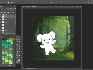
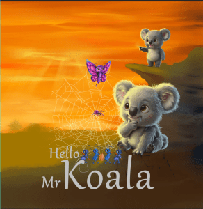
Creating Atmosphere with Light
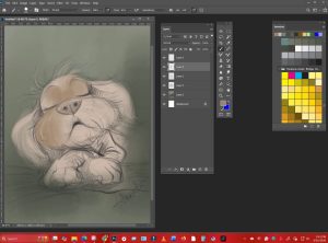
Lighting completely changed this illustration.
At first, the forest felt flat and quiet. The moment warm light entered the scene, everything started feeling more alive.
illustrated by Ananta Mohanta
I painted soft sunlight filtering through the trees because I wanted the environment to feel magical without becoming overwhelming. Young readers should feel curious while looking at the page, not uncomfortable.
Too much darkness can make an image feel heavy. Too much brightness can remove depth and mood.
So I kept adjusting the lighting carefully until the forest finally felt calm, warm, and adventurous at the same time.
The glowing fireflies were added later in the process. Those tiny details may seem unimportant, but they help create movement inside the artwork.
They also add a little mystery.
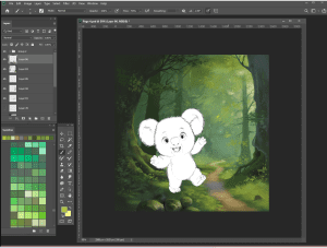
The Details Children Remember
Toward the final stage, I focused on smaller details.
I added texture to the mossy ground, softened some shadows, and placed tiny highlights inside the koala’s eyes.
Those highlights changed the entire expression.
Suddenly the character no longer looked like a drawing. He started feeling alive.
Illustrated by Ananta Mohanta
That is one of my favorite moments during illustration work — when a character begins showing personality without needing words.
Children notice those emotional details immediately.
In my experience, they rarely care whether an illustration is technically perfect. What they remember is how it made them feel.
That is why atmosphere matters so much to me while illustrating childrens books.
I want children to pause on a page and imagine themselves walking beside the character.
Maybe the koala is searching for something hidden deep inside the forest.
Maybe he is beginning his very first adventure.
I prefer leaving space for imagination because children naturally create their own stories while looking at illustrations.
Illustrated by Ananta Mohanta
Final Thoughts
After spending more than 15 years creating children’s book illustrations, I still enjoy the slow process of building a scene from nothing.
A blank canvas can feel intimidating in the beginning, but little by little the story begins to appear — first through rough sketches, then lighting, then atmosphere, and finally emotion.
That transformation is what keeps me passionate about this work.
As a professional children’s book illustrator, my goal has always stayed the same: create artwork that feels warm, memorable, and emotionally honest for young readers.
Because long after children forget certain words from a story, they often remember the illustrations that made them dream.
Why Every Children’s Book Illustrator Knows the Power of a Great Book Cover
By Ananta Mohanta – Children’s Book Illustrator with 15+ Years of Experience
Over the last fifteen years, I’ve illustrated books for authors from different parts of the world. Some came with fully developed stories and unforgettable characters. Others had only an idea they wanted to bring to life. But one thing I’ve noticed again and again is this — many authors underestimate the importance of the cover.
They focus deeply on the writing, which is important, of course. But the cover is often treated as something to finish quickly at the end.
In children’s publishing, that approach rarely works.
As achildren’s book illustrator, I’ve seen how strongly children respond to visuals. Before they understand the plot or read a single sentence, they react emotionally to the artwork in front of them. The cover becomes the very first invitation into the story.
And in many cases, it determines whether the book gets opened at all.
Children Connect With Images Before Words
Young readers experience books differently from adults.
Adults may look at reviews, author names, or summaries. Children usually respond instantly to what they see. Bright colors, expressive faces, magical settings, funny characters — these visual details catch their attention immediately.
I remember watching a young boy at a book fair walk straight toward a cover featuring a tiny astronaut floating in space. He smiled before anyone even explained the story to him. The artwork alone created curiosity.
A strong cover sparks imagination. It encourages children to ask questions.
Who is this character? Where are they going? What adventure is waiting inside?
The cover quietly begins storytelling before the first page is turned.
Illustrated by Ananta Mohanta
The Cover Creates the First Impression
Parents, teachers, and librarians also make quick judgments based on the cover design.
Even a beautifully written story can be overlooked if the cover feels rushed or unprofessional. On the other hand, a thoughtfully illustrated cover immediately gives the impression that care and creativity went into the book.
As a freelance children’s book illustrator, I’ve worked with many independent authors who later realized how much their sales and visibility improved after redesigning their cover.
People naturally trust books that look polished.
Good illustration communicates effort, quality, and professionalism without saying a word.
Illustrated by Ananta Mohanta
A Cover Should Reflect the Feeling of the Story
One of the biggest responsibilities of a children’s book illustrator for hire is capturing the emotional tone of the story through visuals.
Every story carries a different feeling.
Some stories are soft and comforting. Others are adventurous, silly, mysterious, or emotional. The cover should prepare readers for that experience.
That’s why details matter so much.
Warm lighting can make a story feel safe and cozy. Strong shadows and dramatic colors can add suspense and excitement. Even small changes in character expression can completely change the emotional impact of the artwork.
When I create covers, I spend a lot of time thinking about mood because children react emotionally to visuals almost instantly.
They may not explain it in words, but they feel it.
Illustrated by Ananta Mohanta
Memorable Characters Begin on the Cover
In many children’s books, the main character becomes the heart of the entire story.
Long after children forget certain plot details, they often remember how a character looked and felt.
That emotional bond usually starts with the cover illustration.
When designing characters, I try to make them expressive and relatable. Sometimes bravery attracts young readers. Sometimes it’s curiosity, loneliness, excitement, or humor.
Children connect with emotions they recognize.
Strong character design also becomes incredibly important for book series. A recognizable character helps young readers identify future books immediately.
That visual familiarity builds loyalty over time.
Online Bookstores Changed Everything
Years ago, readers discovered books mainly on bookstore shelves. Today, many books are first seen online.
Because of that, cover design has become even more important.
A cover now needs to stand out not only in print but also as a small thumbnail image on a phone or computer screen.
Complicated artwork can lose impact online. Tiny text becomes unreadable. Weak composition disappears among hundreds of other books.
A successful cover needs clarity, strong focus, and visual balance — especially in online marketplaces.
Illustrated by Ananta Mohanta
Illustration Leaves a Lasting Memory
One of the most beautiful things about illustrating children’s books is seeing how deeply children remember images.
Over the years, some parents have shared photos of their children drawing characters from books I illustrated years earlier. Others told me their child recognized a book instantly just from the cover colors alone.
That kind of emotional memory is powerful.
Children experience stories visually and emotionally at the same time. A meaningful cover becomes part of that experience.
It stays with them.
For a children’s book illustrator, there’s no greater compliment than knowing an illustration became part of someone’s childhood memory.
Why Professional Illustration Is Worth the Investment
I understand that publishing a children’s book can feel expensive, especially for first-time authors.
There are editing costs, formatting expenses, printing, and marketing. Because of that, some authors try to save money on the cover.
But the truth is simple.
The cover is usually the first thing readers notice.
Hiring a professional children’s book illustrator for hire means working with someone who understands visual storytelling, composition, typography placement, color harmony, and how children emotionally respond to imagery.
Illustration is not only about creating attractive drawings.
It is about creating connection.
A thoughtfully designed cover can completely change how readers respond to a book.
Illustrated by Ananta Mohanta
Final Thoughts
After more than fifteen years in children’s book illustration, I’ve learned that the cover is never just decoration.
It introduces the story. It builds emotional connection. It shapes first impressions. It invites children into a world they want to explore.
A strong cover gives a story its visual voice.
And for many children, that very first image becomes the beginning of a lifelong love for books.
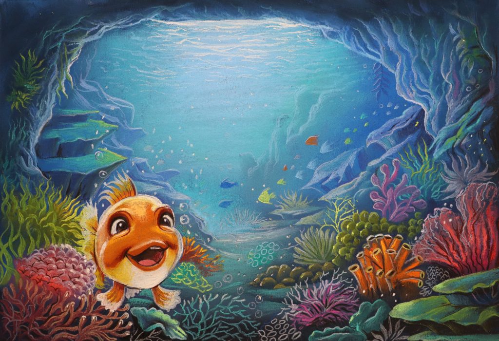
Children’s book illustrator-How I built A handmade underwater illustration from scratch
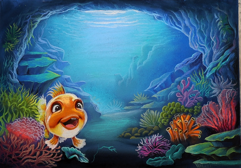
An underwater illustration from scratch as a children’s book illustrator
Illustrated by Ananta MohantaIllustrated by Ananta Mohanta
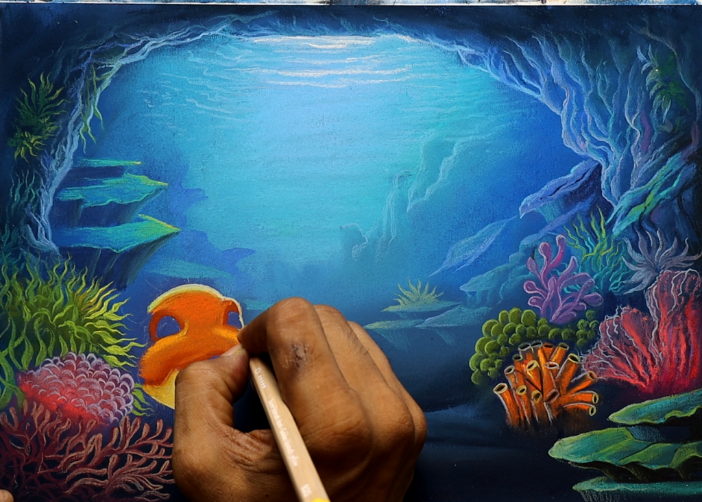
People often see the final artwork first. They see the smiling fish, glowing corals, deep blue water, and soft lighting. But behind every finished illustration, there are many quiet stages that slowly bring the scene to life. As a children’s book illustrator, I enjoy that slow process more than anything else. I never begin with the character immediately. I first sat with the scene’s mood. I imagine how a child might feel as they look at the page before bedtime. I want the children to relate directly to the illustration.
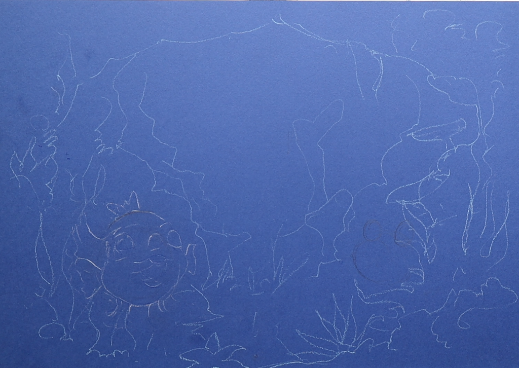
For this underwater scene, I started with a blank, dark surface and gradually built the ocean atmosphere. I made this on ocean blue paper. I just drew the lines roughly. No shape, no perfect structure. Just a rough outline.
Illustrated by Ananta MohantaIllustrated by Ananta Mohanta
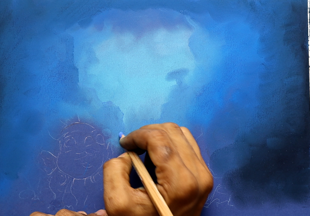
I started deep ocean blue from the corner, the soft blue shades, to make it feel calmer and dreamier. I kept the center area bright to make it look like sunlight was softly entering the ocean water from above. Before drawing characters, I try to imagine and feel the full scene inside my head. I ask myself simple questions. Will it feel magical? Will a child pause and keep looking at the page for an extra second? Those things matter to me more than making the artwork look complicated.
Illustrated by Ananta MohantaIllustrated by Ananta Mohanta
At the beginning, the artwork looked messy and unfinished. Honestly, most illustrations do in the early stage. I think many people would be surprised to see how rough things look before the details arrive.
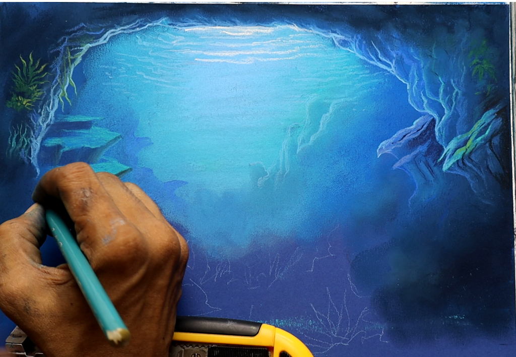
After placing the blue tones, I started shaping the rocky cave areas around the sides. I did not use many hard lines because I prefer softer shapes in children’s illustrations. Soft edges feel friendlier. They also help the page feel more peaceful. At the early stage, nothing looks impressive. It is mostly soft colors and rough shapes. But that part matters a lot because it builds the mood before the characters arrive.
Illustrated by Ananta MohantaIllustrated by Ananta Mohanta
Then I added sea plants and coral forms around the borders. I never like leaving the environment empty. Even a small background area should feel alive. Children notice little things adults often ignore. A tiny plant or hidden shape can become interesting for them. That is one reason I enjoy drawing so much. Children really look at the illustration carefully. Once the underwater background started feeling balanced, I moved towards the fish character. That is always my favorite stage because the character changes the energy of the entire scene. I first made a very light sketch. Nothing detail. I only focused on basic shape and expression. For me, expression is more important than perfection.
Illustrated by Ananta MohantaIllustrated by Ananta Mohanta
I first made a very light sketch. Nothing detail. I only focused on the basic shape and expression. For me, expression is more important than perfection.
I wanted the expression to feel honest before anything else. Children connect very quickly with facial expressions. If the eyes feel empty, the whole illustration loses emotion.
Illustrated by Ananta MohantaIllustrated by Ananta Mohanta
I wanted the fish to look curious, cheerful, almost like it had discovered a new underwater place or met an old friend. So, I made the eyes bright and large. I kept the smile open and playful because a happy expression comes naturally to children. The children’s excitement is important in my work. As a freelance children’s book illustrator, I’ve learned something over the years. Children respond to warmth very quickly. They do not care if a drawing is technically perfect. They care about feeling.
That feeling is always my first priority.
Illustrated by Ananta MohantaIllustrated by Ananta Mohanta
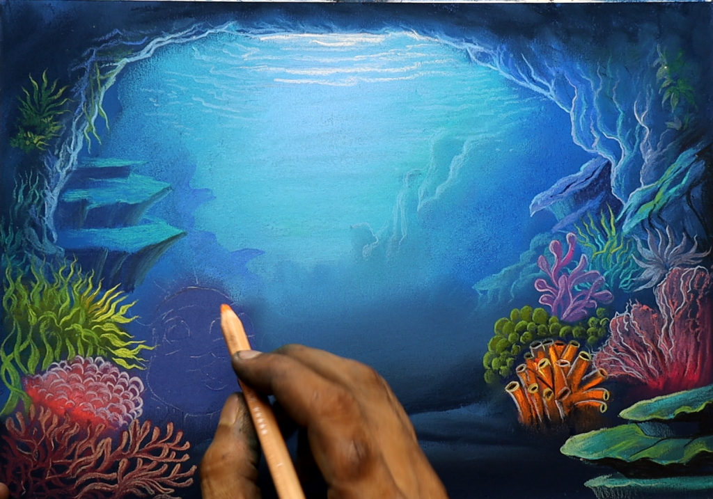
After the sketch was ready, I slowly built color on the character. I chose warm orange tones because the background was mostly cool blue. Warm colors naturally pull the attention. They also try to make the character feel cheerful. They also make the character feel cheerful and friendly. I blended yellow and cream shades around the face to keep the expression soft instead of harsh. I never rush coloring.
I prefer layering color little by little because it creates a smoother and more natural feeling. Hard coloring can sometimes remove the softness from children’s illustrations. I always want my artwork to feel gentle enough for a child’s imagination. As the fish became brighter, I added more details to the underwater world. Corals, sea plants, tiny bubbles, rocks, and glowing textures slowly filled the scene. Children notice details that adults sometimes ignore.
A small coral shape in the corner, tiny bubbles floating upward, or a little fish hidden far in the background can make a child stay longer on the page. That is why I enjoy detailing so much. It adds a small surprise to the artwork.
I always keep that in mind while drawing. I try to create pages that still feel interesting after multiple viewings.
One thing I paid close attention to in this artwork was depth.
I wanted the whole page to feel quiet and peaceful, not noisy. For me, illustration has never been only about drawing nice pictures. I always try to place emotion inside the artwork. I want children to feel curiosity, comfort, happiness, and imagination while looking at the page. That matters much more to me than showing technical skill. As one of many children’s book illustrators working with authors, I know every story deserves warmth and heart inside the artwork. That is what I try to give through my illustrations.
Professional Children’s Book Illustrator for Hire – Process & Style
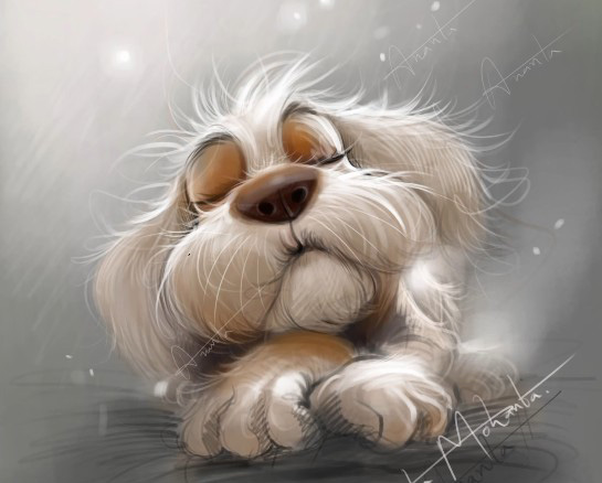
Illustrated by Ananta Mohanta
This little puppy started with a very messy sketch. I was simply trying to catch the feeling of a sleepy dog resting quietly with its paws stretched forward. At that point, there was no plan for details or lighting. I only cared about the mood. That is usually how I begin most of my work as a Children’s Book Illustrator. If the expression feels right in the rough sketch, the rest of the painting becomes much easier later.
Illustrated by Ananta Mohanta
In the second stage, I added a soft grey-green background and blocked in the basic tones of the face and body. I do not like rushing into heavy rendering, as the painting can lose its softness very quickly. Keeping the early layers loose helps the character stay natural. A lot of modernchildren’s book illustration work looks too clean for my taste, so I try to leave small sketch marks visible while painting.
Illustrated by Ananta Mohanta
The fur took time. I painted it slowly using light strokes around the cheeks, ears, and paws. I wanted the puppy to feel fluffy but still simple enough for a storybook page. Sometimes, just a few loose strands of hair can make a character feel alive. Those tiny details matter more than people think.
Illustrated by Ananta Mohanta
By the middle stage, the character finally started looking the way I imagined it in my head. The shadows became softer, the nose had more warmth, and the whole painting began feeling calmer. This is honestly my favorite part of illustrating. It is the moment where a rough drawing slowly turns into someone you could imagine inside a real children’s story.
Illustrated by Ananta Mohanta
In the final artwork, I added faint glowing lights in the background and softened the edges around the puppy. I wanted the scene to feel quiet and dreamy, almost like a peaceful bedtime moment. I did not want dramatic colors or too many effects. Simple moods usually stay longer in a child’s memory.
Illustrated by Ananta Mohanta
Another thing I always pay attention to during the painting process is balance. In children’s books, too much detail can sometimes distract from the emotion of the scene. I try to keep the important areas soft and readable so the viewer notices the expression first. With this puppy illustration, the eyes, nose, and posture were more important than adding complicated textures everywhere else.
I also enjoy using muted color palettes because they create a calmer atmosphere for storytelling. Bright colors can be beautiful, but softer tones often make emotional scenes feel more timeless. Many authors who contact me for children’s book illustration projects mention that they want artwork that feels gentle, emotional, and comforting for young readers. That is usually the feeling I aim for while painting.
As one of many Children’s book illustrators for hire, I believe every illustration should carry a small emotion inside it, even in the quietest scenes.
I’m Ananta Mohanta, a freelance Children’s book illustrator working with authors from different parts of the world for more than fifteen years. Over time, I have learned that good illustrations are not only about technique. They are about emotion, comfort, and personality. Many authors searching for Children’s book illustrators for hire tell me they want artwork that feels warm and honest. That is always the direction I try to follow when I paint.
Every story deserves artwork that children can emotionally connect with, even before they read the first sentence. That connection is what makes illustrated characters memorable long after the book is closed.
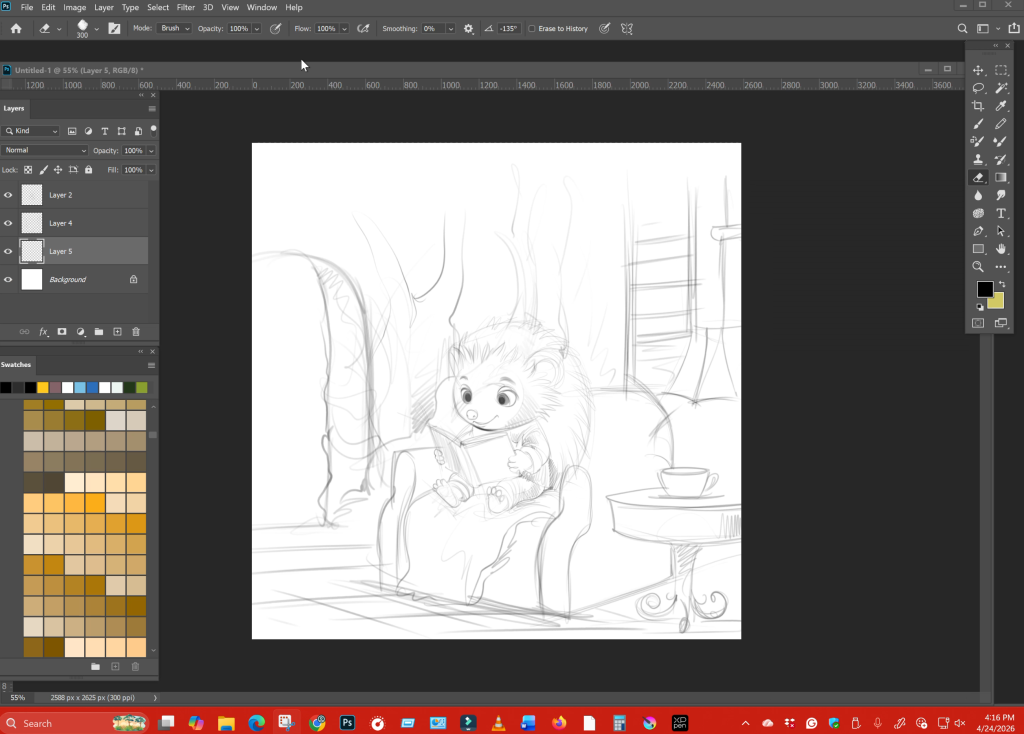
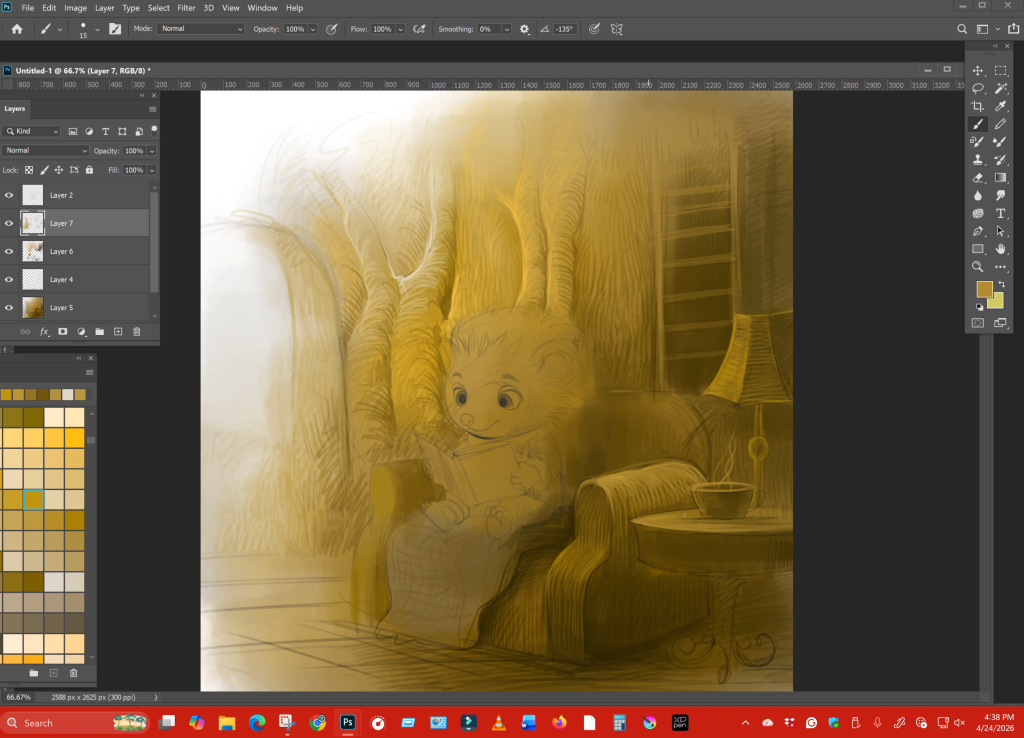
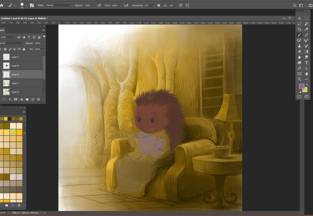
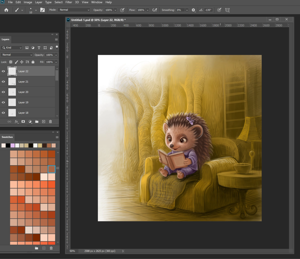
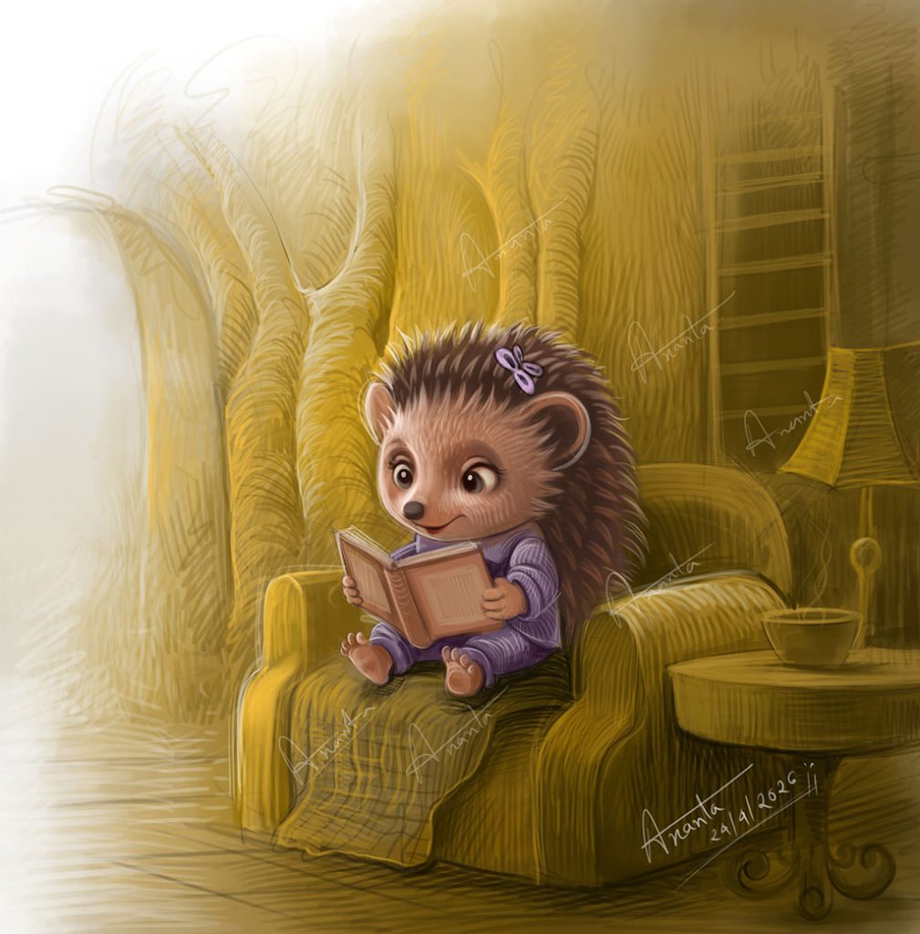
How a quiet reading moment becomes a powerful children’s book illustration
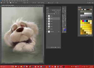
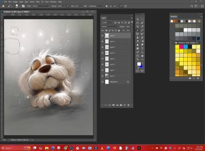
There is something deeply magical about a quiet moment in a children’s book. No action, no chaos. Just a character, a small space, and a feeling that gently settles into a reader’s heart. These are the scenes that children return to again and again- the ones that feel safe, warm, and real.
As a children’s book illustrator, I have found that these calm moments often carry more emotional weight than the busiest, most detailed spreads. A simple scene – like a little character sitting in a chair, reading a book- can speak louder than an entire page filled with movement. But creating that kind of emotional depth is not accidental. It is built carefully, layer by layer.
Illustrated by Ananta Mohanta
Why calm scenes work in children’s books
Children don’t just look at pictures- they live inside them. When a scene is calm, it gives them space to breathe, to imagine, and to connect. A quiet illustration slows the pace of the story. It invites the child to pause, observe, and feel.
In storytelling, contrast is powerful. If every page is loud and energetic, nothing stands out. But when a peaceful moment appears, it becomes a place of rest. It balances the narrative. It also mirrors real life—children understand the comfort of sitting quietly, holding a favorite book, feeling safe in a familiar space. For authors looking to hire a children’s book illustrator, this is something worth paying attention to. An illustrator’s ability to handle silence and stillness is just as important as their ability to draw action.
Illustrated by Ananta Mohanta
Building emotion without movement
One of the biggest challenges for any freelance children’s book illustrator is creating emotion in a scene where nothing is “happening.” There are no running characters, no dramatic gestures. Everything depends on subtle choices. Composition plays a key role. Where the character sits, how much space surrounds them, and how the environment wraps around them—all of this shapes the mood. A slightly curved chair, a soft background, or a gentle flow in the lines can make the entire scene feel more intimate.
Then comes texture. Soft brush strokes, layered shading, and delicate transitions between light and shadow help remove any harshness. The goal is to make the image feel like a quiet whisper rather than a loud statement. Even the smallest detail matters. The way the book is held. The tilt of the head. The placement of the feet. These are not random decisions—they are emotional cues.
Illustrated by Ananta Mohanta
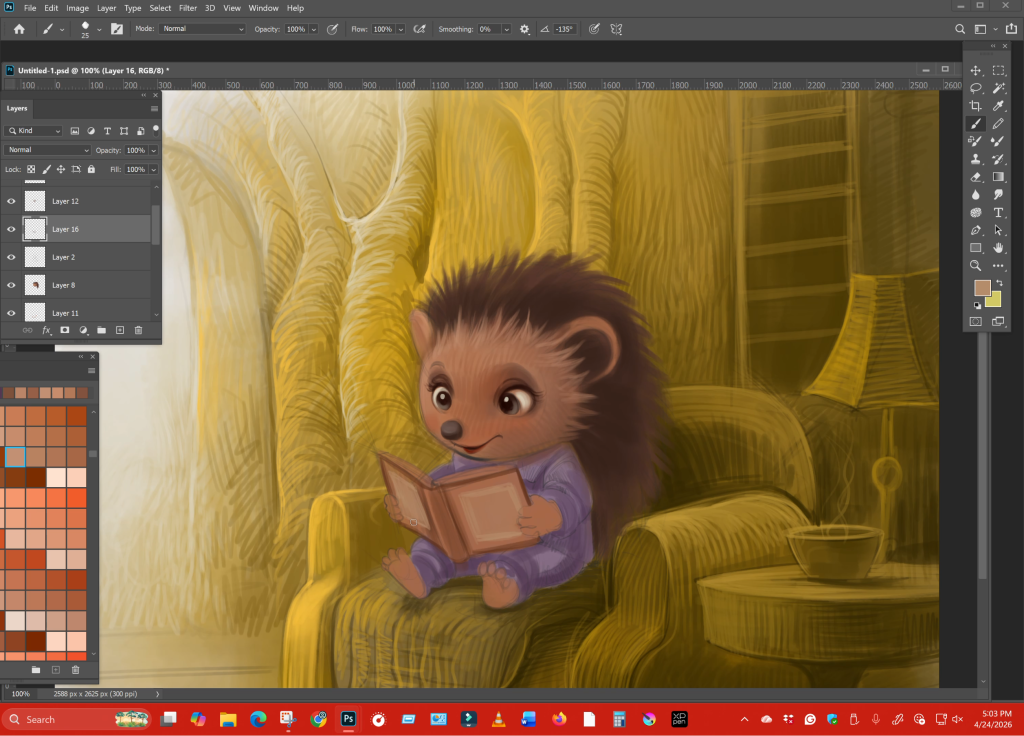
The power of warm yellow tones
Color is often the first thing a child feels before they even understand what they are looking at. In calm scenes, warm tones—especially yellows and soft golds—play a crucial role.
Yellow has a natural association with warmth, light, and safety. It reminds us of sunlight, of evening lamps, of cozy indoor spaces. When used carefully, it wraps the entire scene in comfort.
In this kind of illustration, the yellow is not flat. It shifts subtly lighter in some areas, deeper in others. This creates depth without breaking the mood’s softness. Shadows are not harsh; they blend gently into the surroundings. For a children’s book illustrator for hire, understanding color psychology is essential. Publishers often look for artists who can control mood through color, not just fill space with it.
Illustrated by Ananta Mohanta
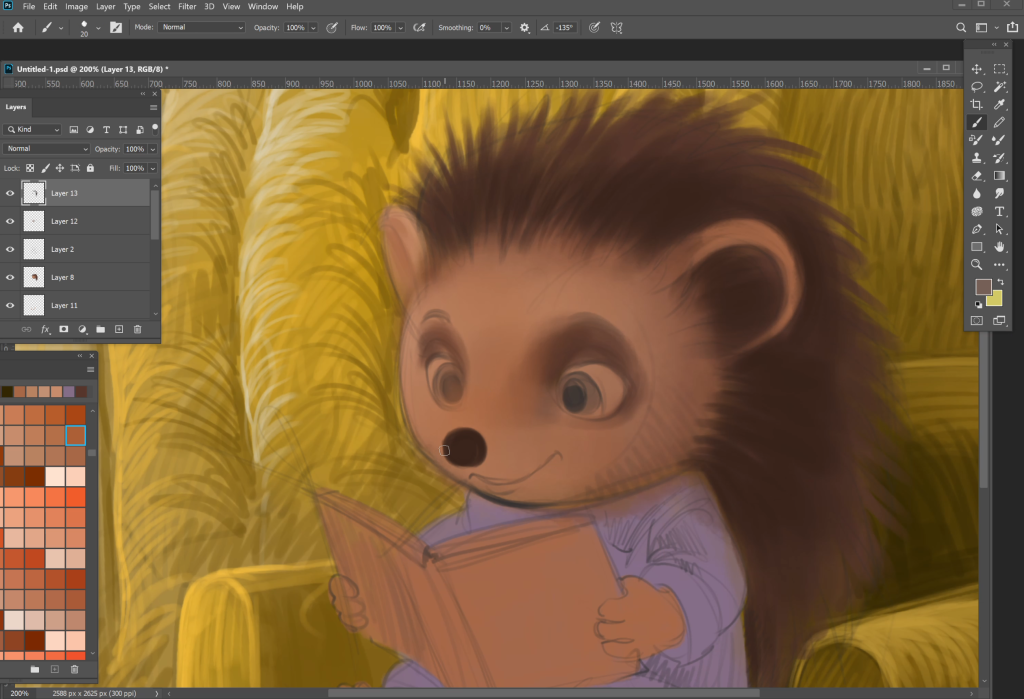
Character expression: Small details, big impact
In a quiet scene, the character carries the entire emotional weight. There is no action to distract the viewer. Everything depends on expression.
The eyes are the most important element. Slightly winded eyes can show curiosity. A gentle downward gaze can show focus. When a character looks at a book with soft attention. The child reading the illustration begins to feel that same focus.
Then comes the smile- not a big, exaggerated one, but a small, natural curve. It suggests contentment rather than excitement. It tells the reader, “This is a peaceful moment”.
Posture adds another layer. A relaxed body. Slightly leaned forward. Creates a sense of comfort and engagement. Even the way the character’s feet rest can influence how grounded the scene feels.
These details may seem minor, but they are what separate a good illustration from a memorable one.
Illustrated by Ananta Mohanta
Why publishers look for feelings, not just skill
Today, there are many artists with strong technical skills. Clean lines, accurate anatomy, and polished rendering are no longer enough. What publishers truly look for is emotional storytelling.
They want a children’s book illustrator who can make a child feel something – even in the quietest scene. They want illustrations that stay with the reader long after the book is closed.
This is especially important for authors who want to hire a children’s book illustrator. The right illustrator doesn’t just draw your story- they deepen it. They bring out emotions that may not even be written in the text.
A calm reading scene might seem simple at first glance. But when done right, it becomes a powerful moment of connection between the child and the story.
Illustrated by Ananta Mohanta
Final thoughts
A quiet illustration is never truly “quiet.” It speaks softly, but it speaks deeply. It builds trust with the reader. It creates a safe space inside the book. As a freelance children’s book illustrator, I believe these moments are where the real magic happens—not in the noise, but in the stillness.
They remember how a page made them feel.
A warm chair. A soft light. A small character holding a book, completely lost in it.
That feeling stays.
And that’s what I try to create every time I sit down to illustrate—not just a scene, but a moment that feels real enough to pause on.
Because sometimes, the quietest pages speak the loudest.
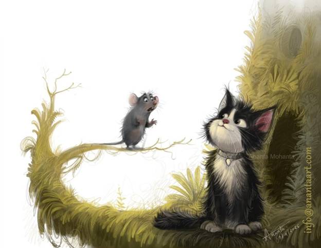
Real children’s book illustrator- from rough sketch to final artwork, every step
When an author looks for a children’s book illustrator, the biggest mistake is judging only the final artwork. A polished image can be misleading. What truly matters is the process behind it. The images you see here are not random stages; they are a complete journey. Each step shows how a simple idea turns into a finished illustration with emotion, depth, and storytelling.
Let’s go through it one by one-
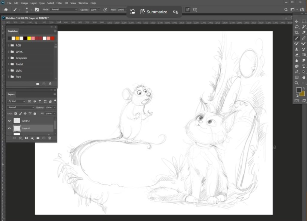
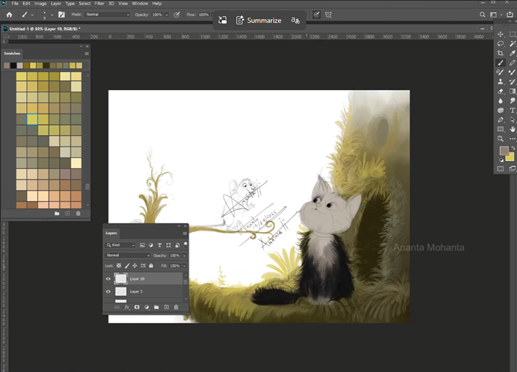
Rough Layout
Illustrated by Ananta Mohanta
Where the Story Begins In your first sketch, everything begin with a rough layout.
The cat sits on the right side, the mouse on a curved branch to the left. The environment is only hinted at—just enough to understand the scene. The branch forms a natural circular flow, pulling the viewer’s eye from the mouse to the cat.
At this stage: No clean lines, no details, only storytelling decisions. You are solving questions like: Where should the characters sit? How do they interact? What space feels natural? This is where a professional illustrator thinks—not decorates.
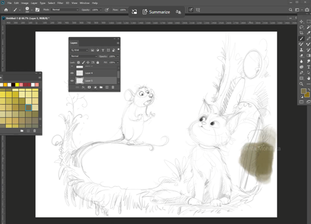
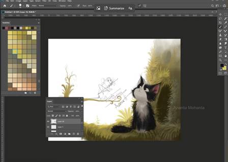
Refined Sketch & Line Art
Structure Takes Shape In the next image, the drawing becomes more confident. The cat’s face is clearer, the mouse’s posture more expressive. You can already feel the relationship between them—curiosity from the cat, slight nervousness from the mouse.
Important things happening here-
Lines are still soft, not even clean.
Expressions are defined.
Anatomy is adjusted for appeal.
This stage proves something important-
If the drawing works in the line, it will work in color
Many inexperienced illustrators skip this strength and rely on effects later.
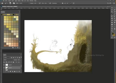
Environmental blocking- building the world
In the 3rd image, the color begins, but not everywhere.
You first focus on the background environment. Especially on the right side, just tree foliage appears.
The mossy texture and warm, earthy tones begin to shape the mood.
Notice- 1. The background starts to develop before the characters.
This is not random coloring. It’s a planning atmosphere.
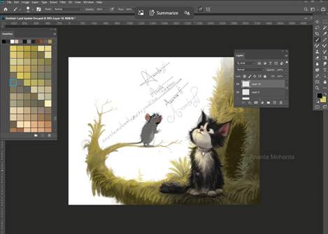
Character integration- Bringing focus to the scene
In the next stage, the cat is rendered while the mouse is still in sketch form.
This is where patience matters most-
Layer by layer.
One character is finished first to set the quality and lighting.
The rest follows the same standard.
The cat has now-
Soft fur rendering
Controlled highlight
Warm and cool balance
The background fades softly, keeping focus on the interaction
5.The mouse has gentle highlights that keep it visible.
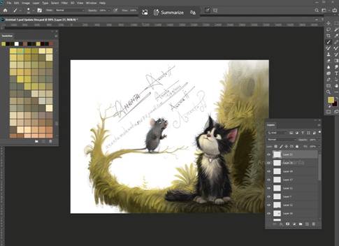
Final pass- everything comes together
In the last stage, I complete the mouse and refine the entire scene. The mouse is fully painted, the branch is detailed, and the environment wraps around the characters. The lighting is soft and consistent.
Now I focus on small things:
how light touches the characters
how much detail the background should have
where to keep things soft
Nothing should distract from the interaction between the cat and the mouse.
Even the background is toned down slightly to keep focus on where it belongs.
What I am trying to show-
1. The cat’s fur is not flat black- it has depth and variation
2. The mouse remains noticeable, even though it is small
3. The background does not overpower the characters.
Character Design – Keeping It Simple (On Purpose)
The cat and mouse are not overdesigned.
That’s intentional.
The cat is soft, rounded, and almost fluffy enough to feel harmless and curious. The mouse is small, slightly exaggerated, so the emotion reads clearly.
Children respond to clarity, not complexity.
Too many details actually work against the story.
Color Variation – Controlled, Not Overdone
Your palette stays consistent throughout:
Earthy greens
Warm yellow light
Subtle contrast
Instead of using too many colors, you:
Adjust tones within a range
Use light to create focus
Keep harmony across the scene
That’s what gives the illustration a calm, storybook feel.
And that honesty is exactly what authors should look for when trusting someone with their story. Watch my full children’s book illustration or digital illustration video on my YouTube channel-
What Really Goes Into Designing Characters for Freelance Children’s Book Illustration
Illustrated by Ananta Mohanta
If you open a children’s book after many years, chances are you won’t remember every line of text. But you will remember the character. That one face, that one expression, the way they stood or smiled — it sticks.
That’s why, in freelance children’s book illustration, character design is not just a step in the process. It’s the part that quietly carries the whole book.
I’ve been doing this for years, and even now, I don’t treat character design lightly. It’s never just “draw something nice.” There’s always more going on behind it.
I Don’t Start with Drawing Anymore
This might sound strange, but I don’t begin with sketches.
I sit with the story first.
Even a simple children’s story has a certain feeling to it. Some feel warm and calm. Some feel playful and fast. Some have a bit of emotion hidden underneath.
If I don’t catch that feeling, the character comes out wrong — even if the drawing looks good.
So I read. Sometimes twice. Not in a hurry.
In children’s book illustration, the drawing part comes later than most people expect.
The Character Has to Feel Like a Person
One thing I’ve learned over time — if I don’t understand the character, I can’t draw it properly.
Not just what they look like, but how they behave.
Are they the kind who jumps into things without thinking? Or the kind who watches quietly from the side?
These things change everything. Even posture.
A confident character stands differently. A shy one almost folds into themselves a little.
In freelance children’s book illustration, these small details matter more than adding extra design elements.
I Keep the Design Clear, Not Busy
There was a time when I used to add a lot of details. Patterns, textures, small decorative things everywhere.
It felt like I was doing more work, so it must be better — that’s what I thought.
But it didn’t help.
Children don’t respond to complexity the way adults do. They respond to clarity.
Now I simplify things. Clean shapes. Clear silhouettes. Something you can recognize quickly.
If there’s one thing I focus on the most, it’s expression.
You can get everything else right — colors, proportions, style — but if the face feels blank, the character falls flat.
I spend time adjusting small things. The tilt of the eyes, the spacing, the curve of the mouth.
Sometimes I draw the same face again and again until it feels right.
Children connect through emotion, not technique. That’s something every children’s book illustrator learns sooner or later.
Drawing the Same Character Again and Again Is the Real Challenge
Creating a character once is not the hard part.
Keeping it consistent across 20 or 30 illustrations — that’s where things get tricky.
Different angles, different poses, different scenes… but it still has to feel like the same character.
In freelance children’s book illustration, I usually make a rough guide for myself. Nothing complicated. Just a few reference sketches to stay on track.
Without that, the character slowly starts to change without you noticing.
Working with Authors Is Part of the Process
Every project comes with a different kind of author.
Some have very clear ideas about how their characters should look. Others give full freedom.
I’ve worked with both, and honestly, both are good in their own way.
What I always try to do is share rough ideas early. Not finished artwork — just basic sketches.
It keeps things flexible. If something feels off, it can be corrected easily at that stage.
It’s easy to get carried away trying to make something “look good” from an artist’s point of view.
But that’s not who the book is for.
A child looks at things differently. They don’t analyze. They react.
So I ask myself simple things: Is it clear? Is it friendly? Is it interesting enough to hold attention?
In children’s book illustration, simple emotional connection is more important than technical perfection.
Style Is Not the Starting Point
A lot of people think style comes first. I don’t see it that way anymore.
Style grows over time. It shows up naturally in your work.
But when I’m working on a book, I don’t force a specific look just to match a style.
The story decides the direction. Some stories need softer visuals. Some need something more bold or playful.
In freelance children’s book illustration, being flexible actually helps more than sticking to one fixed style.
Closing Thoughts
At the end of the day, character design is not about drawing something attractive. It’s about creating something that feels real within the world of the story.
If the character works, everything else becomes easier — the scenes, the storytelling, the flow of the book.
If it doesn’t, even the best artwork won’t fix it.
Ananta Mohanta is a freelance children’s book illustrator with over 15+ years of experience. He works with authors of various kinds from around the globe. He is best known for his high-quality children’s book illustrations, professionalism, and punctuality.
For those searching for children’s book illustrators for hire or planning to work with a freelance children’s book illustrator, it helps to know that strong characters don’t happen by chance.
They take time, observation, and a lot of quiet thinking before the first line is even drawn.
The Quiet Craft Behind Coloring Books: A Children’s Book Illustrator’s Perspective
illustrated by Ananta mohanta
Not every children’s book illustrator works with bright colors all the time. Some of the most thoughtful work happens in black and white—inside coloring books. These books don’t shout for attention. They invite it quietly.
At first glance, a coloring book page might seem easy to create. Just outlines, no shading, no color. But after years of working as a freelance children’s book illustrator, I can say the opposite is true. The fewer elements you use, the more careful you have to be.
Drawing Without Finishing the Story
In most children’s book illustration, the artist completes the scene. The colors are chosen, the lighting is decided, and the mood is set. In a coloring book, the illustrator steps back and leaves that final step to the child.
That changes everything.
You’re no longer finishing the artwork—you’re preparing it. The drawing has to feel complete, yet open. It should look interesting on its own, but still leave room for imagination.
This balance is not easy to achieve. If the drawing feels too plain, the child loses interest. If it feels too busy, they may not even want to start.
Lines Carry More Responsibility Than You Think
When there is no color involved, lines do all the work.
They define shapes, show movement, and even suggest emotion. A slight curve in a line can change how a character feels. A thicker outline can make certain parts easier to color.
Children’s book illustrators who work on coloring books spend a lot of time refining these details. Clean lines are not just about looking neat—they help guide the child’s hand.
If the lines are messy or unclear, the entire experience becomes frustrating.
Knowing Who the Book Is For
One of the first questions I ask before starting any coloring book project is simple: who is this for?
A book designed for a four-year-old is very different from one made for an eight-year-old. Younger children need larger shapes and fewer elements. They are still learning how to control their grip and movement.
Older children, on the other hand, enjoy more detail. They like spending time filling smaller spaces and experimenting with colors.
A children’s book illustrator has to adjust their approach depending on the age group. There’s no one-style-fits-all method in this field.
Letting the Page Breathe
Something that often gets ignored in coloring books is space.
Many beginners try to fill every corner of the page, thinking it will make the illustration more interesting. In reality, it does the opposite. It makes the page feel heavy.
Good children’s book illustration leaves room to breathe. Open space gives children freedom. It also makes the page less intimidating.
As a freelance children’s book illustrator, I’ve learned to step back and look at the page as a whole. If it feels crowded to me, it will feel even more so to a child.
Simple Doesn’t Mean Easy
There’s a common idea that simpler drawings take less effort. In coloring books, simplicity requires control.
You have to decide what matters and what doesn’t. You remove extra details, but you keep the character of the drawing intact.
For example, a tree in a storybook might have detailed leaves, shadows, and textures. In a coloring book, that same tree has to be simplified without losing its identity.
This is where experience plays a big role. Over time, you develop a sense of what to keep and what to leave out.
Why Authors Are Looking for Skilled Illustrators
Coloring books are becoming more popular again, especially among parents who want to reduce screen time. Because of this, many authors are searching for children’s book illustrators for hire who can create clean, engaging pages.
But not all illustrators approach coloring books the right way.
Authors are starting to understand the difference between a quick outline and a well-designed page. They want illustrations that children will actually enjoy using, not just flipping through.
This has created a steady demand for experienced children’s book illustrators who understand how to work with line art.
My Way of Working on Coloring Books
Every project I take on begins with listening.
I try to understand what the author wants, what kind of story or theme they have in mind, and who the book is meant for. Once that’s clear, I start sketching ideas.
I don’t rush into final lines. I take time to adjust proportions, spacing, and expressions. Even small changes can improve how a page feels.
After that, I move into clean line work. I keep it steady and natural, making sure each part of the drawing is easy to follow.
Working with authors from different parts of the world has taught me to stay flexible. Each project brings something new, and I enjoy that process.
The Value of a Good Coloring Book
A well-made coloring book does more than pass the time.
It helps children focus. It gives them a sense of control. It allows them to make choices and see the results of those choices.
Behind every page is a children’s book illustrator who has thought carefully about how that experience will feel.
That’s something many people don’t notice—but it makes all the difference.
Closing Thought
Being a children’s book illustrator in the world of coloring books means learning to step back. You’re not there to finish the picture. You’re there to start it.
And when a child picks up a crayon and begins to color, the illustration comes to life in a way no printed color ever could.